Blue Puddle Celebrates 10th Anniversary with Full Renewal, Announces SI (Sticker Identity) – A CI Tool for Anything
Blue Puddle, celebrating its 10th anniversary, has undergone a full renewal, including its corporate site and CI, and announced 'SI (Sticker Identity),' a new brand tool that transforms anything into a CI tool.
📋 Article Processing Timeline
- 📰 Published: April 2, 2026 at 18:40
Blue Puddle Inc. (Representative Director: Neji Sato) has implemented a corporate website renewal, a refresh of its CI (Corporate Identity), and the development of a new brand tool, 'SI (Sticker Identity),' ahead of its 10th anniversary. This renewal began with a two-month strategic review of 'WHO (who are the customers) and WHAT (what value do we deliver)' before the website production.
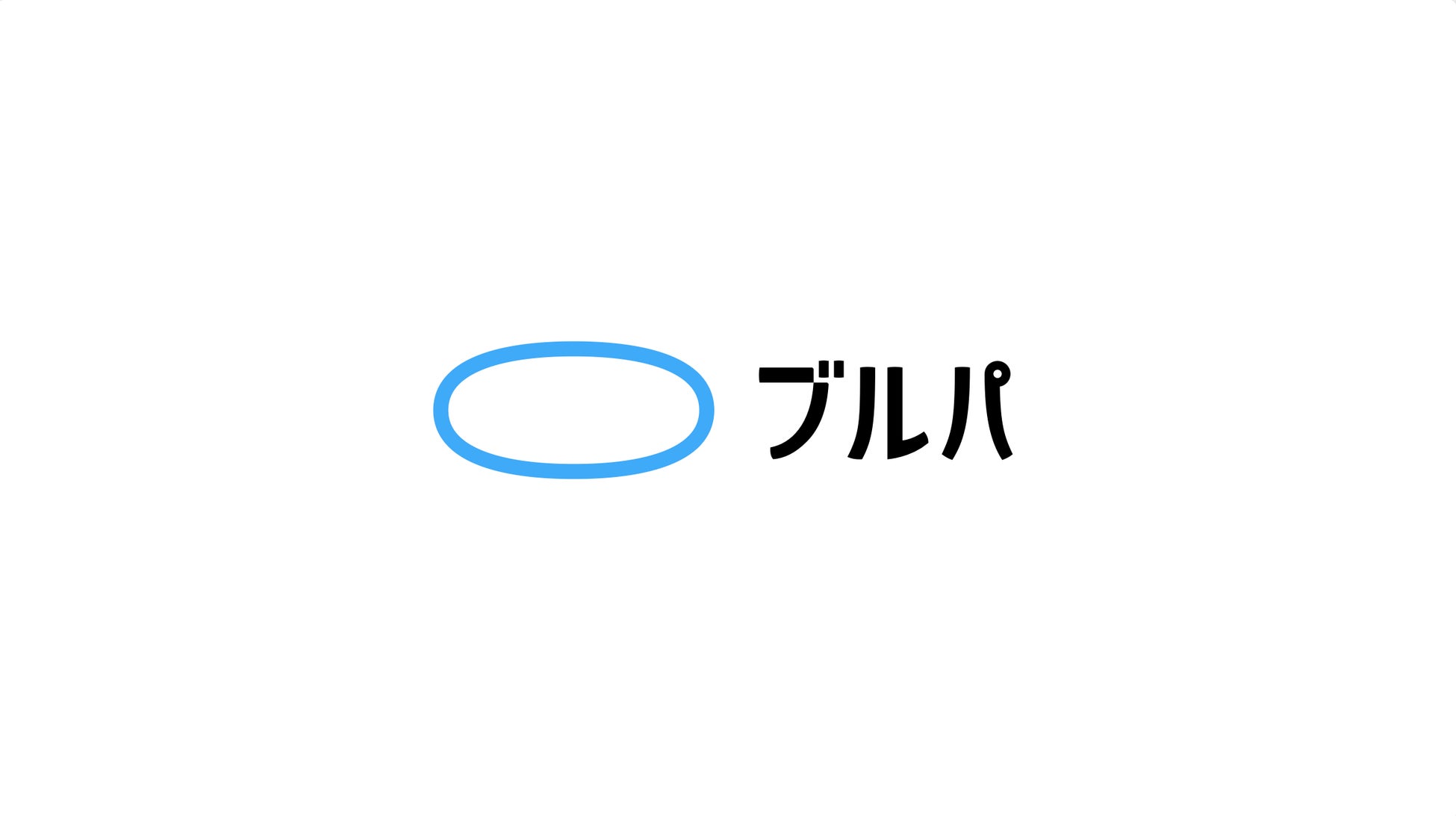
● Blue Puddle
CI Refresh: From English Logo to Japanese Logo
When the core target for 'WHO' was identified as 'person in charge at new companies,' the name 'Blue Puddle' was found to be difficult to read. Therefore, to coincide with the 10th anniversary, the English logo was changed to a Japanese logo.
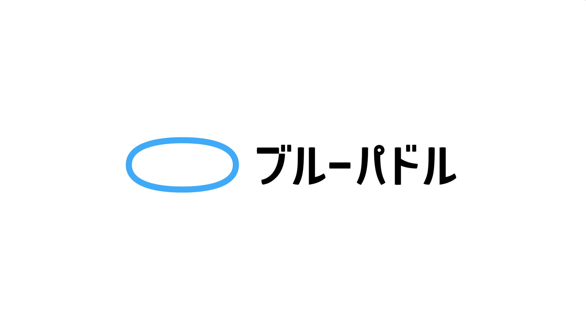
It might be unusual for a design company with an English logo to switch to a Japanese one, but this decision was based on strategy (the English logo will continue to be used). Furthermore, a responsive logo was also created, which changes its size and layout depending on the usage scenario.

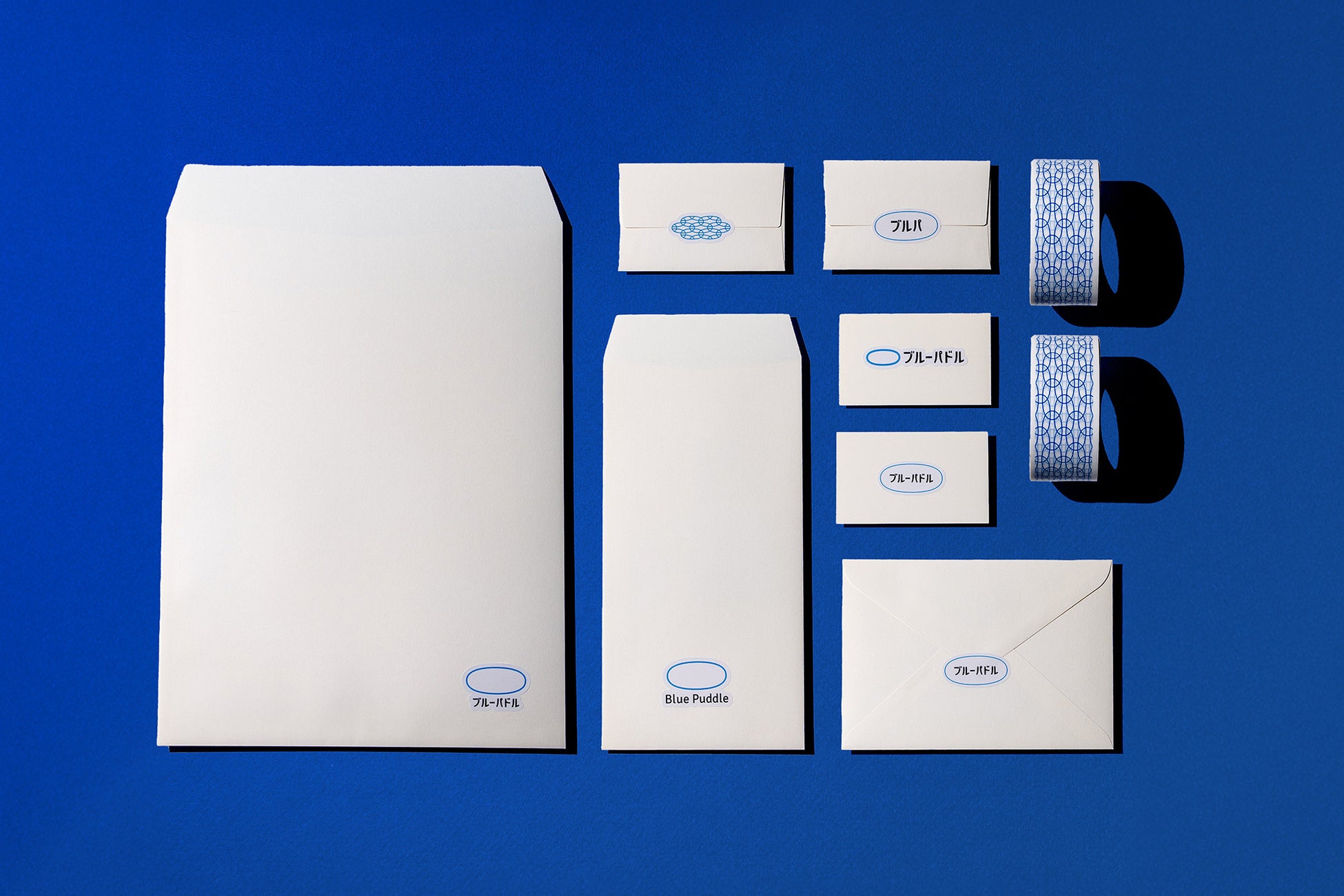
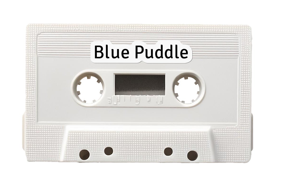
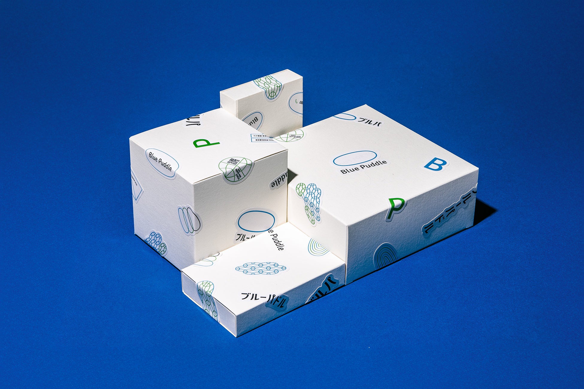
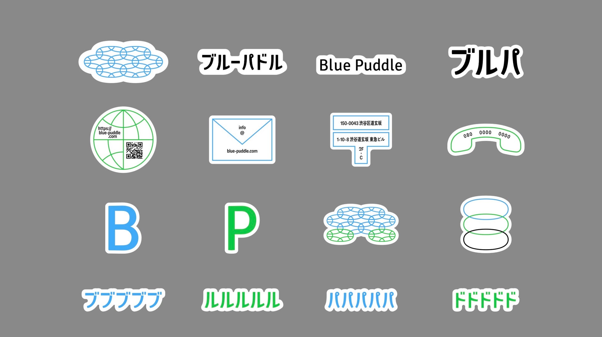
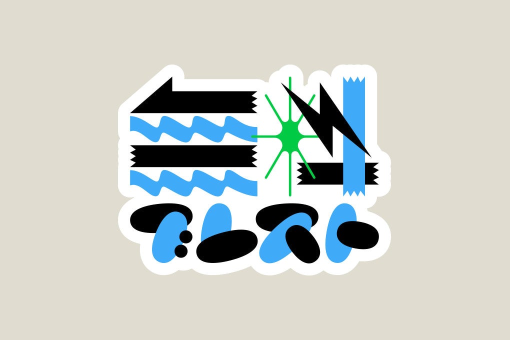
SI (Sticker Identity): A New Way to Make Anything a CI Tool
Along with the CI review, CI tools such as envelopes and paper bags were considered, but it was decided that printing them was not necessary. Therefore, a sticker-based format was adopted.
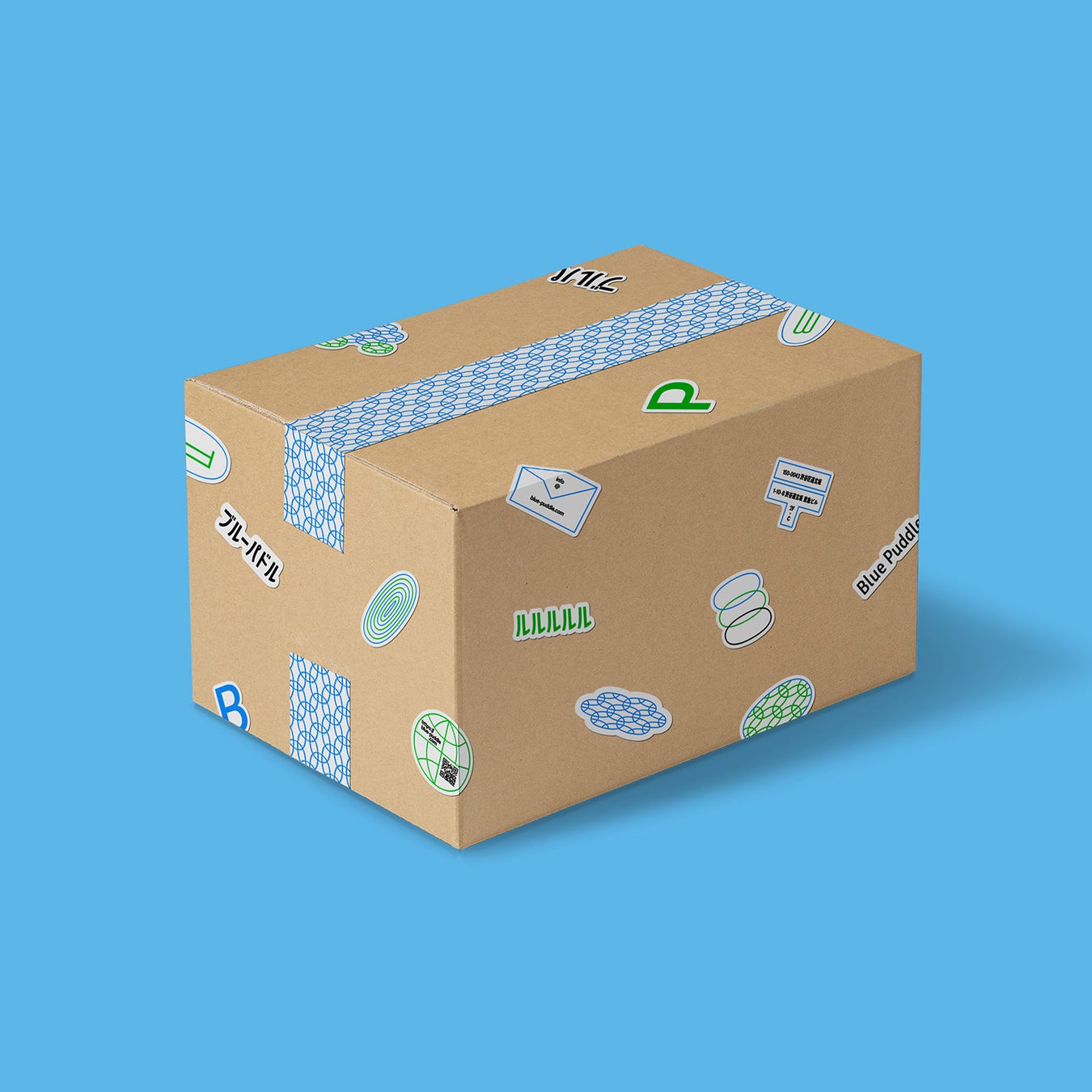
This was named 'SI (Sticker Identity).' By simply applying a sticker, anything from cardboard boxes to envelopes to cassette tapes can be transformed into a CI tool.
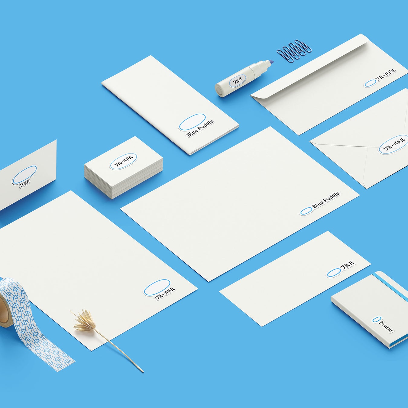

For small companies and creators, producing large quantities of custom-printed materials can be a burden in terms of cost and inventory. With SI, you can transform anything into a brand tool, as needed, when needed.
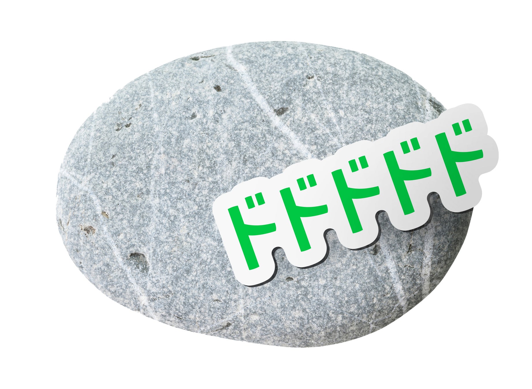
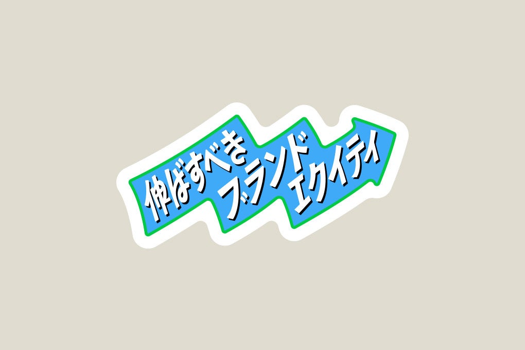
Stickerization of Brand Equity
Additionally, Blue Puddle has directly turned its 'brand equity to be strengthened' into stickers.
Brand equity refers to the 'awareness and image' associated with a brand. The more firmly it is etched in the target's mind, the more likely the brand is to be chosen. It's surprisingly rare to typographically represent the very words that convey the most important image/keywords. This time, we incorporated that into the design.


Site Renewal: "WEB from Strategy
FAQ
What is SI (Sticker Identity)?
SI is a new branding method that allows anything, such as cardboard boxes or envelopes, to be transformed into a company's CI tool simply by applying a sticker. It reduces cost burdens for small businesses and creators.
Why did Blue Puddle change from an English logo to a Japanese logo?
Based on a strategy targeting new corporate clients, the English logo 'Blue Puddle' was deemed difficult to read. The Japanese logo was adopted for clarity, though the English logo will still be used.
What is the purpose of Blue Puddle's latest renewal?
To commemorate its 10th anniversary, Blue Puddle reviewed its customer strategy (WHO/WHAT) and revamped its corporate website, CI, and introduced the new SI brand tool, aiming for more effective branding and market approach.