H.C. Tochigi Nikko Ice Bucks (Operated by Tochigi Nikko Ice Bucks Inc., Nikko City, Tochigi Prefecture, Senior Director: Sergio Etsugo, hereinafter "Nikko Ice Bucks") announces that the club's secondary logo and the uniform design for the 2026-2027 season have been decided.
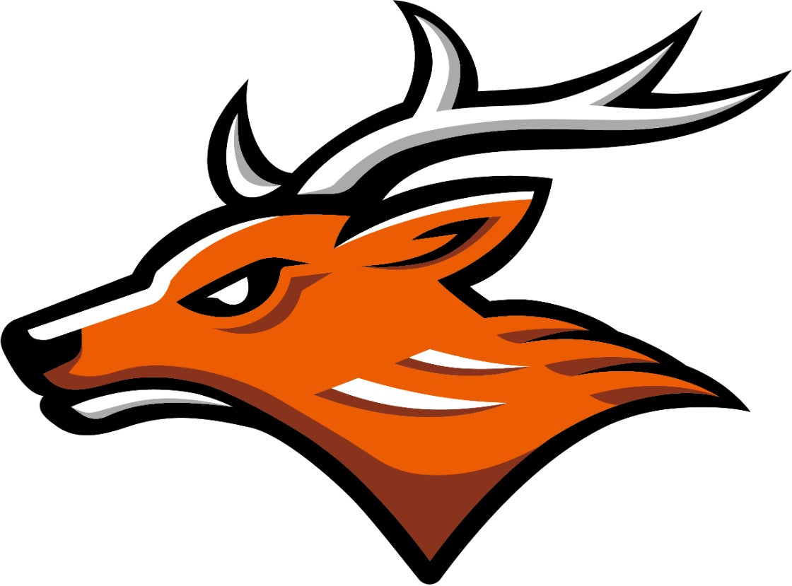
The "Deer Logo," the club's first secondary logo, is a modern reconstruction of the profile of a deer motif used by the club's predecessor, Furukawa Electric Ice Hockey Club, expressing strength and speed.
The new uniform design, which players will wear in the Asia League Ice Hockey 2026-2027 starting on September 12 (Sat), incorporates color schemes never before adopted, while based on team colors, to convey the determination for new challenges.
The navy, adopted as a new sub-color, is inspired by "Kachi-iro," a traditional Japanese color. Kachi-iro, a color favored for its auspiciousness by samurai since the Kamakura period, is combined with the history of Japan's oldest professional ice hockey club and a strong obsession with victory.
The main design features a gradient that changes from thin lines to thick lines. The thin lines express "speed" and "quiet concentration," while the thick lines express "intense body contact" and "unyielding mental strength." The connection of these lines represents the accumulation of the club's history, the changes towards the future, and the team uniting to aim for victory.
The secondary logo and new uniform designs were handled by Mr. Tabito Mizuo, a designer from Beams Inc.
Adorned with the new logo and uniforms, we will continue to fight for the top spot with our fans and the community in the 2026-2027 season.
Please see below for details.
Secondary Logo "Deer Logo" Design
HOME Uniform
AWAY Uniform
3rd Uniform
*Pants and helmets will be announced separately.
*Please note that sponsor logos may be logos may change.
FACT BOX
- Source: PR TIMES
- Category: スポーツ