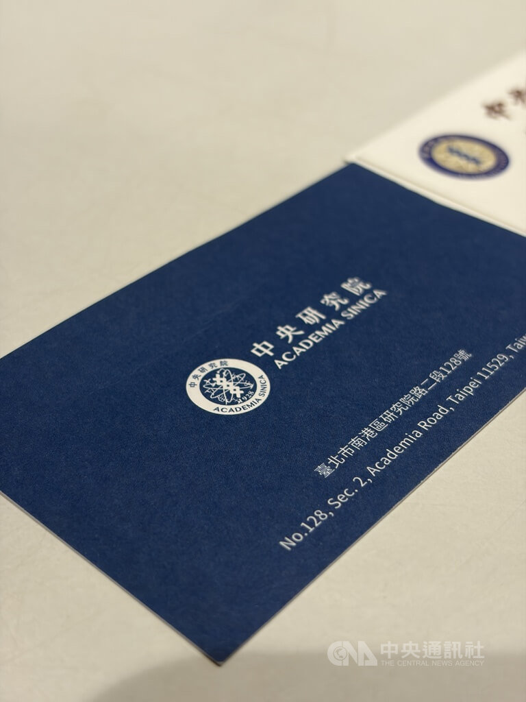
(CNA reporter Wu Hsin-yun, Taipei, 21st) Academia Sinica today addressed legislators' concerns about a new visual identity added to its brand identification in 2020. The academy emphasized that the move was to enhance visual effects in response to science popularization and the emergence of new platforms, and that it was not a replacement for the old identity but rather a parallel system. The founding emblem of Academia Sinica uses the calligraphy of its first president, Tsai Yuan-pei. In 2020, the academy added a new visual identity, including new fonts and colors. The Legislative Yuan was reviewing the Academia Sinica unit's budget within the central government's total budget for the 115th year today, when a legislator raised concerns about the visual identity added by the academy six years ago. Academia Sinica's Secretary-General, Tseng Kuo-hsiang, noted in a media interview after the meeting that the new visual identity, added six years ago, cost NT$1.04 million. The project contract covered preliminary analysis and related design for Academia Sinica's basic and applied brand identification systems, such as business cards, work IDs, presentation templates, colors, auxiliary graphics, and printing and web usage guidelines (like poster design), with a total of 10 companies bidding. Tseng said the new visual identity was initially added to enhance visual effects for science popularization and the emergence of various dissertation platforms, a trend seen in universities worldwide, and can be used when creating posters for science outreach. Tseng also mentioned that when the traditional calligraphy characters of the old identity are scaled down, they cannot be fully rendered, and there can be color blurring issues on web platforms. Therefore, the new identity was also intended to solve this technical problem. Tseng stressed that the two different visual identities—one more calm, reserved, and traditionally humanistic, the other more youthful and lively—are both available on the Academia Sinica website for staff to freely download and use in different contexts. Academia Sinica President Liao Chun-chih also clarified during the inquiry that it was an overall optimization of the visual image, not just a change of font, and that the two systems are currently running in parallel. (Editor: Lee Heng-shan)
FACT BOX
- Source: CNA (Central News Agency)
- Category: 政策