Ceres Inc. (Head Office: Shibuya-ku, Tokyo; Representative Director and President: Satoshi Toki; Securities Code: 3696; hereinafter "Ceres") is pleased to announce that it will refresh its corporate logo starting April 1, 2026.
Since its establishment, Ceres has upheld the vision of "realizing a prosperous world through internet marketing," operating a mobile services business centered on "Moopy," one of Japan's largest point sites, and a financial services business comprising cryptocurrency exchanges and online factoring. Ceres has positioned 2025, its 20th anniversary, as a new starting point for future growth and has redefined its MVV (Mission, Vision, Value) *1. Based on this, we have decided to refresh our corporate logo in line with the new fiscal year in 2026.
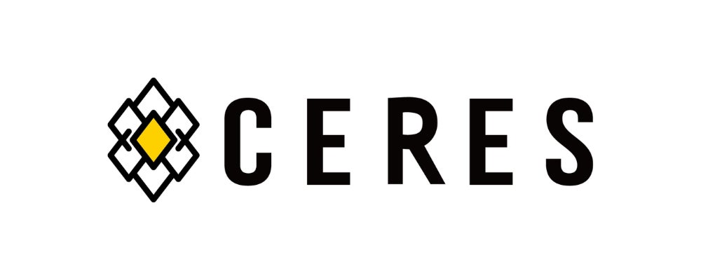
The new corporate logo inherits the design of the old logo, which featured "buds and wheat ears" inspired by the company name Ceres, derived from the Roman goddess of harvest, and values such as "nature," "diversity," and "the sprouting of life." At the same time, it newly incorporates the mission "Blossoming of Value, Abundant Future" and has been reconstructed from a complex shape to a minimalist one. This update to a simple and approachable design reflects Ceres' desire to be a familiar and trusted presence for more people.
Moving forward, Ceres will continue to strive to realize a prosperous world through internet marketing, under the mission of "Blossoming of Value, Abundant Future."
*1: MVV is an acronym for "Mission," "Vision," and "Value," a concept that indicates the basic philosophy and decision-making framework for a company or organization.
Ceres upholds "Blossoming of Value" and "Abundant Future" as its mission, and under the vision of "realizing a prosperous world through internet marketing," all employees will conduct their activities guided by the five actions outlined in its Values.
The new corporate logo inherits values such as "nature," "diversity," and "the sprouting of life" from the old logo, while newly incorporating the mission "Blossoming of Value, Abundant Future," and has been reconstructed into a minimalist shape. The delicately interwoven chain of rhombuses embodies the "cycle of value" where seeds sprout, connect, and eventually bear fruit in society. The structure is also designed to resemble rice ears or particles of light, symbolizing the way individual possibilities overlap and weave together the future. It is a design that extracts only the "core" to convey universal ideas more strongly, without losing the essence of the brand, while stripping away visual elements. The logo has been updated from the complex shape of the old logo to a simple and approachable one.
【Design Concept】
・Expresses "Ceres (Goddess of Harvest)" with buds and wheat ears
・Expresses Ceres' new mission "Blossoming of Value, Abundant Future" with a flower
・Expresses "a company shining brightly at the center of internet marketing" with the flower's core
Ceres Company Overview
Company Name: Ceres Inc.
Representative: Satoshi Toki, Representative Director and President
Location: Shibuya Sakura Stage, SHIBUYA Tower 21F, 1-1 Sakuragaoka-cho, Shibuya-ku, Tokyo
URL: https://ceres-inc.jp/
FACT BOX
- Source: PR TIMES
- Category: News